Why this matters: The 90 seconds after a parcel lands in a customer’s hands can determine your LTV. Treat the mailer as a media channel and you’ll turn first-time buyers into repeat loyalists—and every doorstep into a mini content studio. At Hezemon, we help brands engineer that moment with smart subscription box packaging design, purposeful storytelling, and measurable unboxing experience design—all wrapped in eco-friendly packaging graphics your customers feel proud to share.
The conversion science behind the unboxing moment
Unboxing is not just aesthetics. It’s a structured path from anticipation → discovery → activation:
- Anticipation (outside the box): Signal value on arrival. A distinct color block, brand mark, and a promise line prepare the mind for delight. This is where subscription box packaging design sets expectations before the first cut of the tape.
- Discovery (inside the box): Sequential reveals—tissue → printed inner lid → hero product—reduce cognitive load and heighten emotion. Crisp unboxing experience desig* organizes the order of delight so nothing competes for attention.
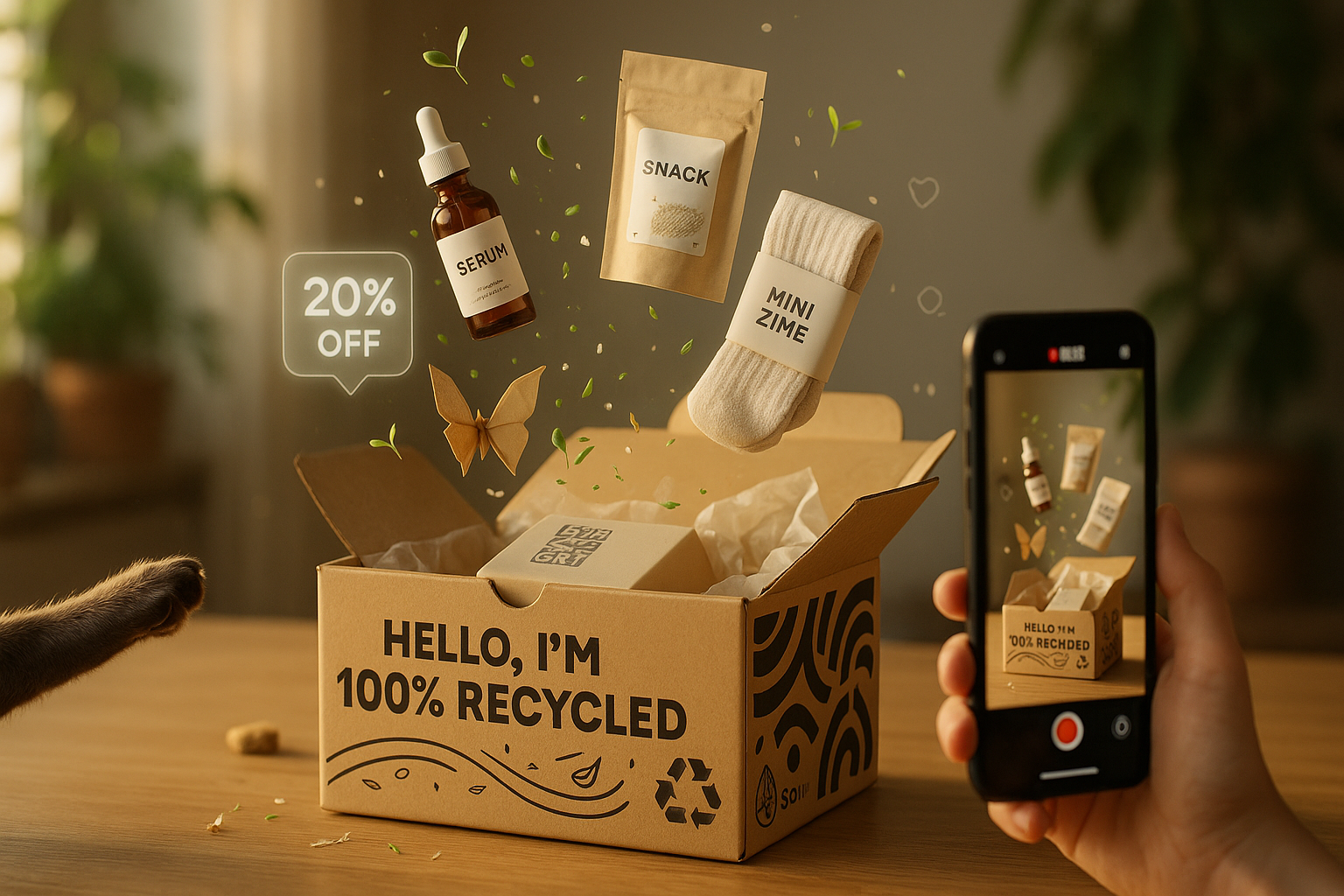
- Activation (after the reveal): A tiny nudge turns joy into action—share, reorder, refer. Thoughtful eco-friendly packaging graphics can include short reuse instructions (“peel, fold, plant”) that feel good and get talked about.
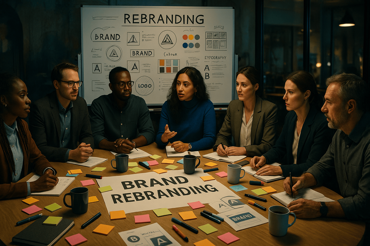
The 5-panel packaging canvas (and what each panel should do)
Treat every surface as a job-to-be-done. This keeps subscription box packaging design intentional, not ornamental.
-
Top/Lid (hook):
One big promise: “Refill joy in 30 seconds.” Pair with a scannable code. Keep ink coverage light to support eco-friendly packaging graphics.
-
Side Panels (identity):
Rotating benefit blurbs + recycled iconography. Mention material %. This subtle sustainability proof lifts perceived value and aligns to unboxing experience design that respects the planet.
-
Inner Lid (story):
A 50–70 word narrative: why the product exists and what to try first. This is prime acreage for subscription box packaging design that guides the very first usage.
-
Insert/Thank-you (action):
One CTA only—“Tap to reorder with 1 click,” “Gift a friend for 20% off.” Your unboxing experience design should minimize steps between delight and repurchase.
-
Base (reuse + UGC):
Simple diagram: “Cut along the dotted line to turn this into a desk tray.” Add “Share your tray: #MyHezemonBox.” Sustainable reuse drives shares and justifies eco-friendly packaging graphics choices.
UGC engine: turn mailers into media
UGC happens when you make sharing easier than not sharing. Build that into the unboxing experience design:
- Printed prompts: “Snap your first sip!” / “Show us where it lives on your shelf.”
- Framing marks: Minimal corner guides inside the lid to line up the perfect flat-lay.
- QR to story flow: QR opens a pre-filled camera/story template.
- Micro-incentive: “Monthly draw for best setup—no post required, stories count.”
- Creator credit: Feature customers on a public gallery; print a tiny URL on future runs. This reinforces subscription box packaging design as a community touchpoint.
Eco choices that sell (and tell)
Sustainability isn’t a footnote—it’s part of the pitch. Customers re-buy when they feel aligned with your values.
- Materials: FSC-certified kraft, 30–70% post-consumer content. Print these facts directly; they are your eco-friendly packaging graphics.
- Inks & finishes: Water-based inks, soy alternatives, and minimal lamination. Matte kraft + spot white can look premium and planet-first.
- Right-size fit: Smart dielines reduce void fill and shipping cost—an unsung hero of subscription box packaging design.
- End-of-life clarity: “Recycle box, compost tissue, keep insert.” Clear icons are part of good unboxing experience design and prevent wish-cycling.
Copy cues that move people to buy again
Tight copy on the right surface outperforms long prose.
- Top: “Refills, ready when you are.”
- Inner lid: “Start with the [hero item]. 10-second setup inside.”
- Insert: “Reorder in one tap: scan → confirm. Ships tomorrow.”
- Base:“This box becomes a desk tray—flip + fold. Show us: #MyHezemonBox.”
Each line earns the right to be printed. If it doesn’t drive use, share, or repeat, it doesn’t ship.
Measure what matters (and iterate by print run)
Your box is a testable asset. Bake tracking into the unboxing experience design.
- Reorder scans per 100 boxes (unique QR with UTM by print batch)
- UGC rate (posts/stories tagged ÷ boxes shipped)
- Return rate delta (compare “with insert” vs “without insert” cohorts)
- Time-to-second purchase (lift vs. previous packaging)
- Sustainability mentions (count qualitative references to eco-friendly packaging graphics in reviews/DMs)
Report these alongside CAC/LTV to prove packaging’s revenue role.
Mini-case: 60-day redesign for a grooming subscription
A D2C grooming brand engaged Hezemon to overhaul subscription box packaging design. We simplified the outside, added a one-tap reorder insert, and rewrote the inner-lid microcopy to guide first use. We also introduced eco-friendly packaging graphics with recycled content badges and a reuse fold for a razor stand. Outcomes in 60 days:
- +31% reorder QR scans
- +22% UGC volume (stories over posts)
- –14% damaged-in-transit (right-sized dieline)
- +9% lift in repeat within 45 days
Small changes in unboxing experience design drove big behavioral shifts.
Hezemon’s quick-start checklist
- One promise on the lid (no more)
- Inner-lid story <70 words, action-led
- Insert with a single CTA + unique QR
- Reuse diagram on base (easy + photogenic)
- Material + ink disclosures as eco-friendly packaging graphics proof
- Batch-level tracking (UTMs per print run)
- Quarterly review of subscription box packaging design variants
Final word (and a simple next step)
Your next growth lever might not be a new ad—it could be a smarter box. When subscription box packaging design guides usage, when unboxing experience design removes friction, and when eco-friendly packaging graphics make customers proud, repeat buys become a habit and UGC becomes free reach.
Want a 7-day Packaging Audit and a print-ready insert you can test next month? DM Hezemon with “UNBOX” and we’ll share our template pack and a mini roadmap for your next print run.